
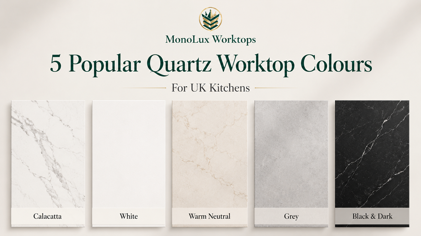
Choosing a quartz colour gets much easier once you stop comparing dozens of product names and start with a few broad families. For most kitchens, the main colours are Calacatta and marble-effect quartz, white, warm neutral and warm-white, grey and concrete-effect, and black or dark quartz.
The 2026 UK Houzz Kitchen Trends Study, based on 402 UK homeowners involved in kitchen renovation projects, found engineered quartz in 50% of new or upgraded worktops.
Across all worktop materials, white was reported by 32% of respondents, off-white by 26%, and veined patterns by 58%. Those figures cover more than quartz, so they cannot rank quartz colours on their own. They do show why pale, off-white and veined surfaces remain useful starting points for UK kitchens.
Colour is only one part of a fitted quote. If you are also comparing quartz worktop prices, keep the stone choice separate from layout, thickness, cut-outs and fitting so you can judge the appearance first and the final quote afterwards.
Which Quartz Worktop Colour Family Suits Your Kitchen?
Cabinet undertones, flooring, the amount of uninterrupted worktop and the light in the room can make two similar samples look very different once installed.
| Colour family | What it looks like | Useful starting point for | Check before choosing |
| Calacatta and marble-effect | Pale base with visible grey, gold or darker veining | Islands, long runs, navy, timber and neutral cabinets | Vein scale, vein colour and background tone |
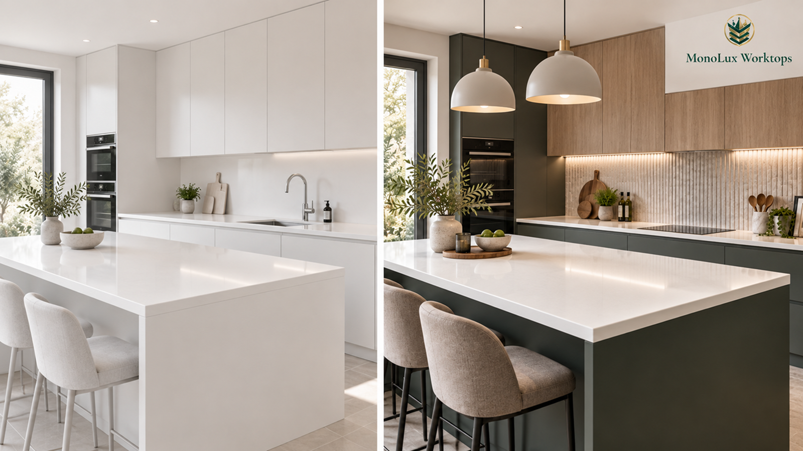
| White | Plain, lightly patterned or subtly sparkled | Shaker, handleless, dark cabinetry and simple colour schemes | Warm white versus cool white |
| Warm neutral and warm-white | Cream, beige, greige or warm pale backgrounds | Oak, walnut, cream cabinets and warmer flooring | Undertones beside cabinets and floor finishes |
| Grey and concrete-effect | Light grey through graphite, either uniform or softly clouded | White, timber, black and handleless cabinets | Warm versus cool grey, plus polished or satin-matte finish |
| Black and dark | Uniform black, charcoal, sparkle or dark marble effect | Pale cabinets, timber, feature islands and high-contrast kitchens | Lighting, pattern and visible fingerprints or pale residue |
Calacatta and Marble-Effect Quartz
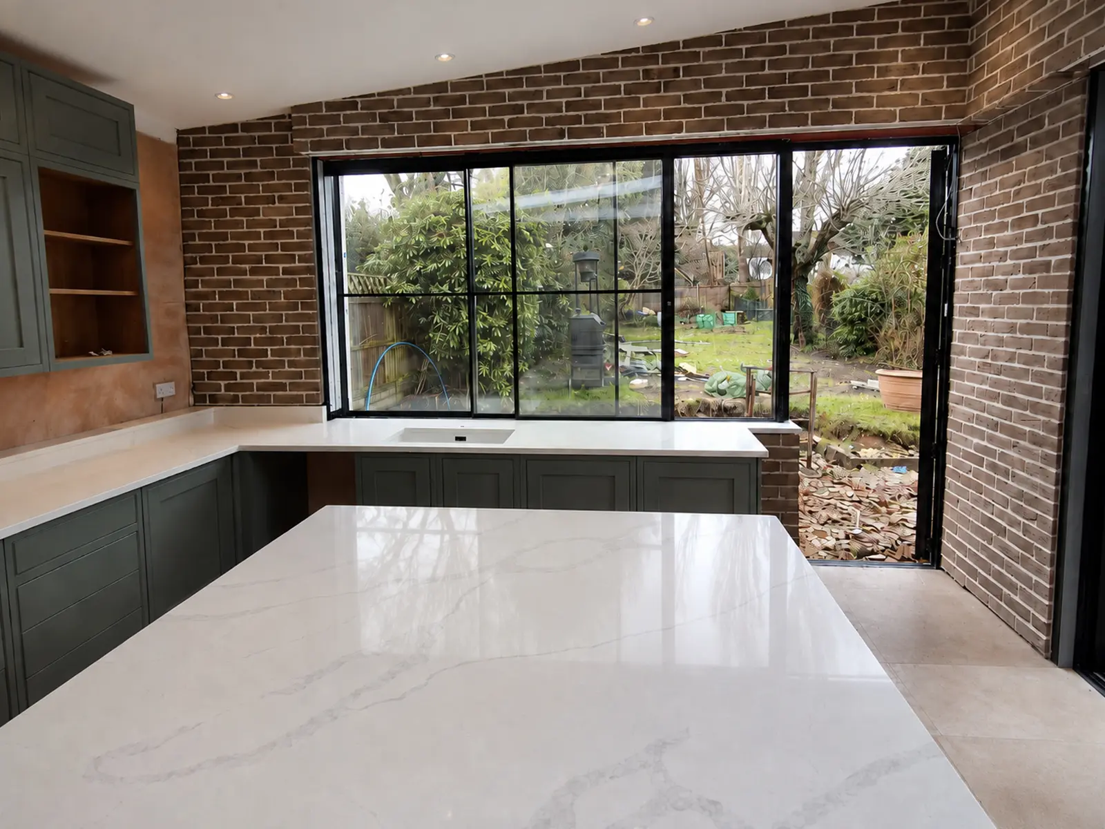
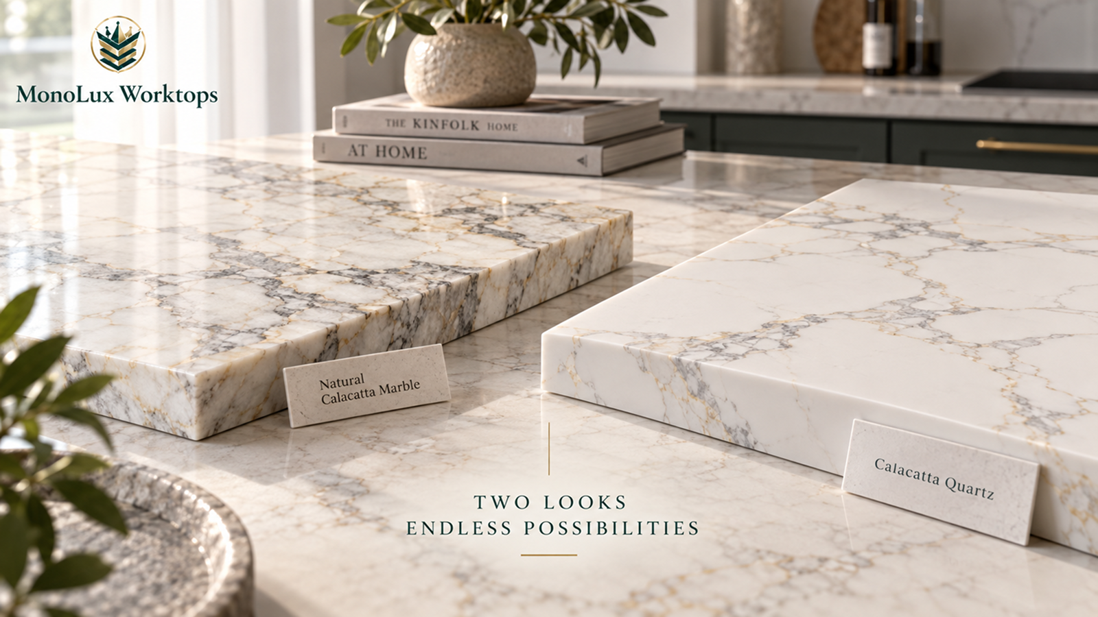
Calacatta covers a wide range of marble-effect designs. Start with the background tone, then compare the colour, width and movement of the veins. A crisp white base with cool grey veining creates a sharper combination than a warmer white carrying gold or bronze detail.
If you are comparing the two main styles, our guide to Calacatta vs Carrara quartz explains how their veining, colour and overall appearance differ.
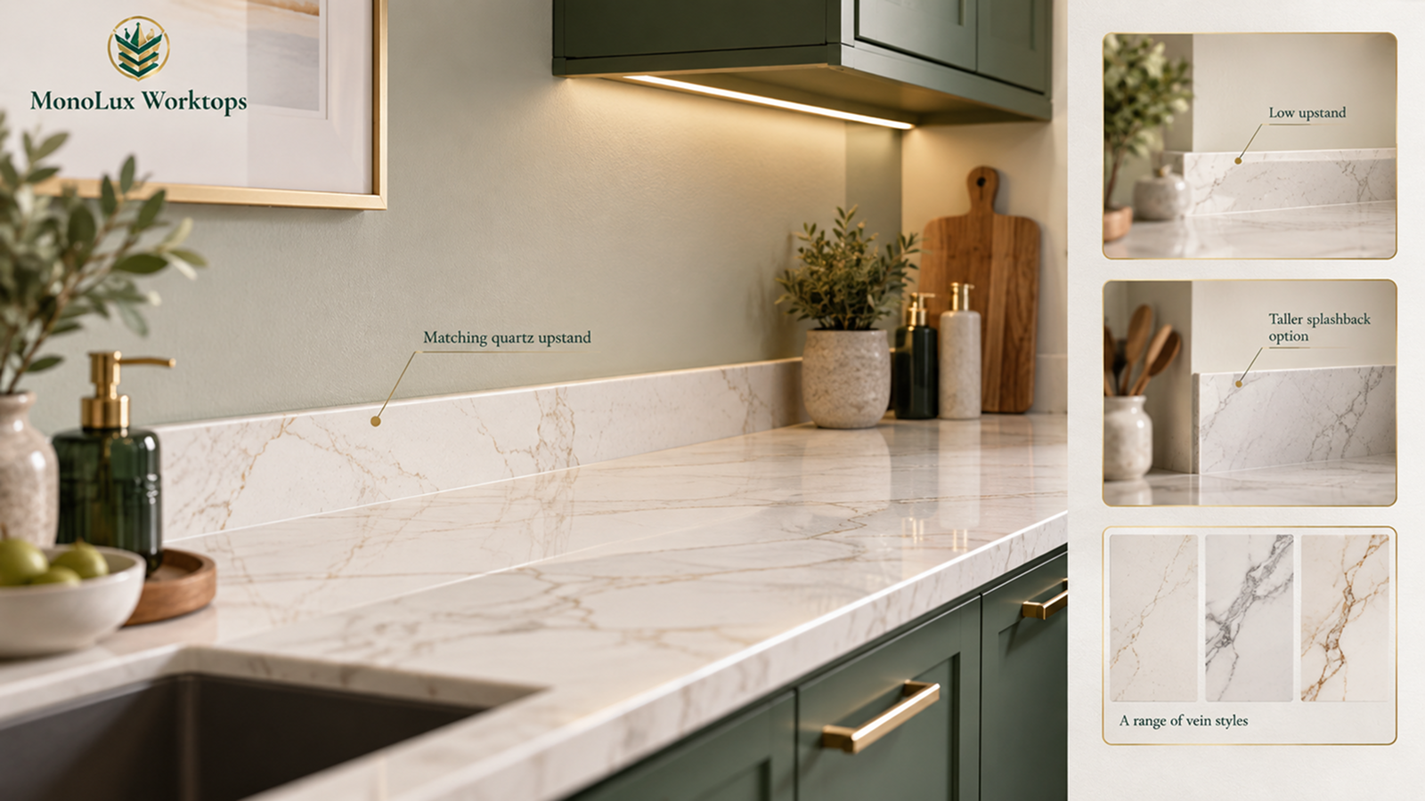
Calacatta Eternal Grey has a bright white background with bold, flowing grey veins. Calacatta Gold introduces warm gold detail alongside the grey movement. If you are considering this style, read whether gold-veined quartz worktops are still in style and how to use them without making the kitchen feel overly decorative. On a large island or a long uninterrupted run, broad veining has enough surface area to develop across the stone. On a narrow run, only part of the same pattern may be visible.
Choosing cabinet colours for Calacatta quartz changes the overall combination significantly. Navy works with both crisp grey-veined and gold-veined Calacatta, while warmer gold detail can connect naturally with brass fittings or warm timber.
Oak can pick up cream, gold or brown notes on the surface. White cabinetry needs closer comparison because two whites that look similar separately may show a clear warm-cool difference once they sit next to each other.
If Calacatta is already your preferred family, browse our Calacatta quartz colours to compare the available vein patterns and background tones.
White Quartz
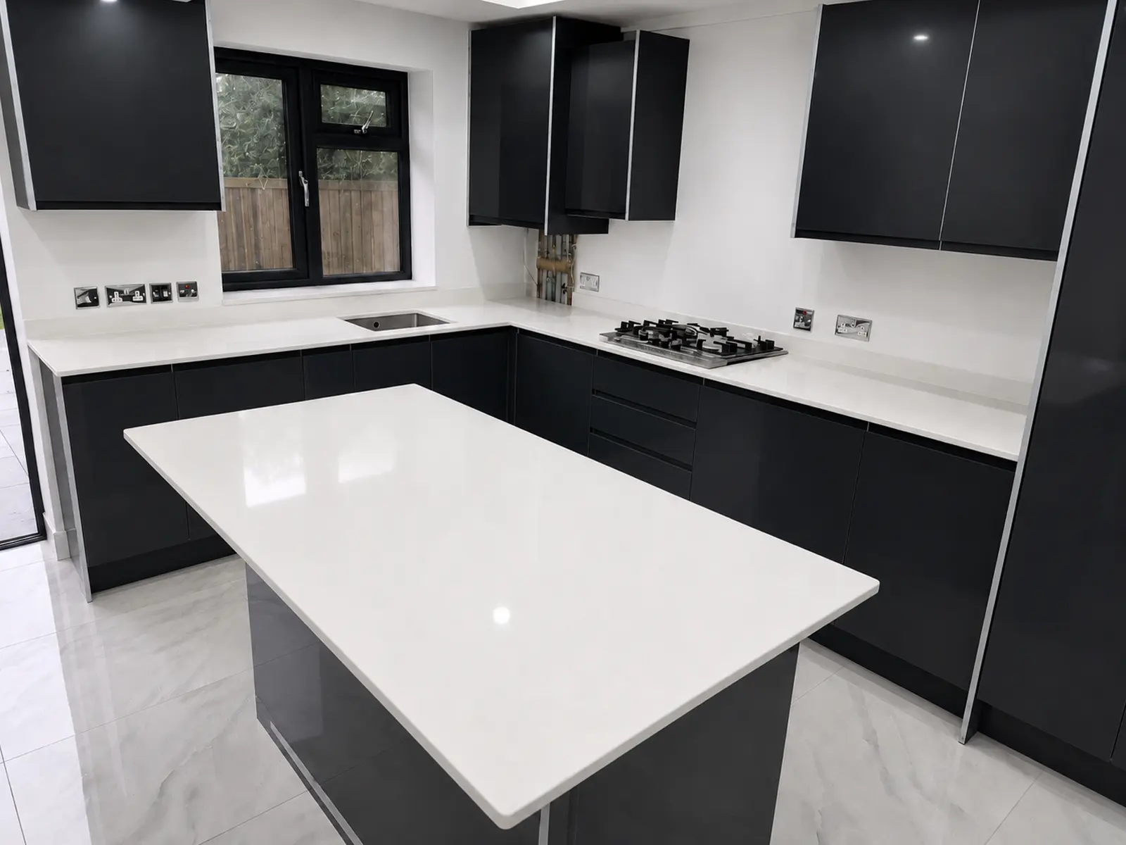
White quartz is not one uniform look. The amount of pattern makes a noticeable difference to the finished kitchen.
- Plain white keeps the worktop visually simple and puts more attention on cabinetry, handles and splashbacks.
- Subtle movement or fine speckling breaks up a large surface without introducing strong marble-style veins.
- Light sparkle-like Arctic Starburst quartz adds reflective detail that becomes more visible under direct kitchen lighting.
The Ultra White quartz is a straightforward, plain-white example. The Aspen Ice quartz worktop moves further towards decorative white, with a cool background and subtle sparkle. The wider white quartz worktops range also includes lightly detailed and marble-effect options.
The undertone becomes particularly noticeable in a white-on-white kitchen. A sample that looks neutral by itself can appear blue, grey or cream beside the cabinet door. A very cool white next to warm cream cabinetry can make the cabinets look yellower than expected, so put the actual finishes together before settling on a shade.
Plain pale surfaces can also make dark crumbs or coloured spills easier to notice because the contrast is strong. This is a question of visibility, not stain resistance. Speckling and movement may make small marks less obvious at a glance, but the pattern does not change the durability of the quartz.
You can also compare the best white quartz worktops for modern and traditional kitchens if you are unsure how much pattern or veining suits your kitchen style.
Warm Neutral and Warm-White Quartz
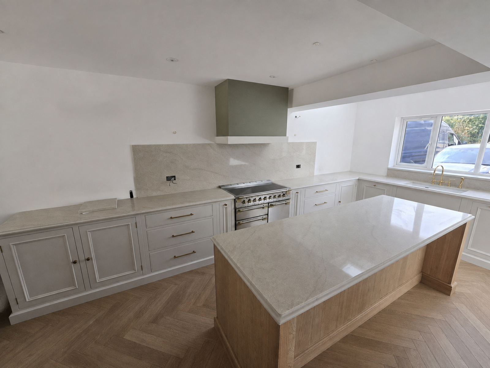
Warm-neutral quartz covers cream, beige, greige and warmer pale backgrounds. These colours make sense in kitchens that already contain oak, walnut, cream cabinetry, beige flooring or warm metal finishes, particularly when a crisp blue-white surface would create a much sharper contrast.
In our current range, Taj Mahal quartz has a warm cream background with beige and light-brown movement. Arabescato Brown goes in a similar direction with brown and grey movement over a soft white background. The warmth comes from the base and undertones, so a white quartz with a few gold veins does not automatically belong in this group.
Our Taj Mahal project in Bristol shows the surface alongside a warm timber island, off-white Shaker cabinetry, brass details and full-height splashbacks. Those materials share warm undertones, so the worktop sits comfortably between the timber and the lighter cabinets without introducing a stark white strip through the room.
Light can shift these colours noticeably. Cooler daylight can pull greige towards grey, while warm evening lighting can strengthen cream, beige and gold notes. A warm-neutral sample is therefore worth checking directly against the cabinet and flooring rather than judging it against a plain background.
Grey and Concrete-Effect Quartz
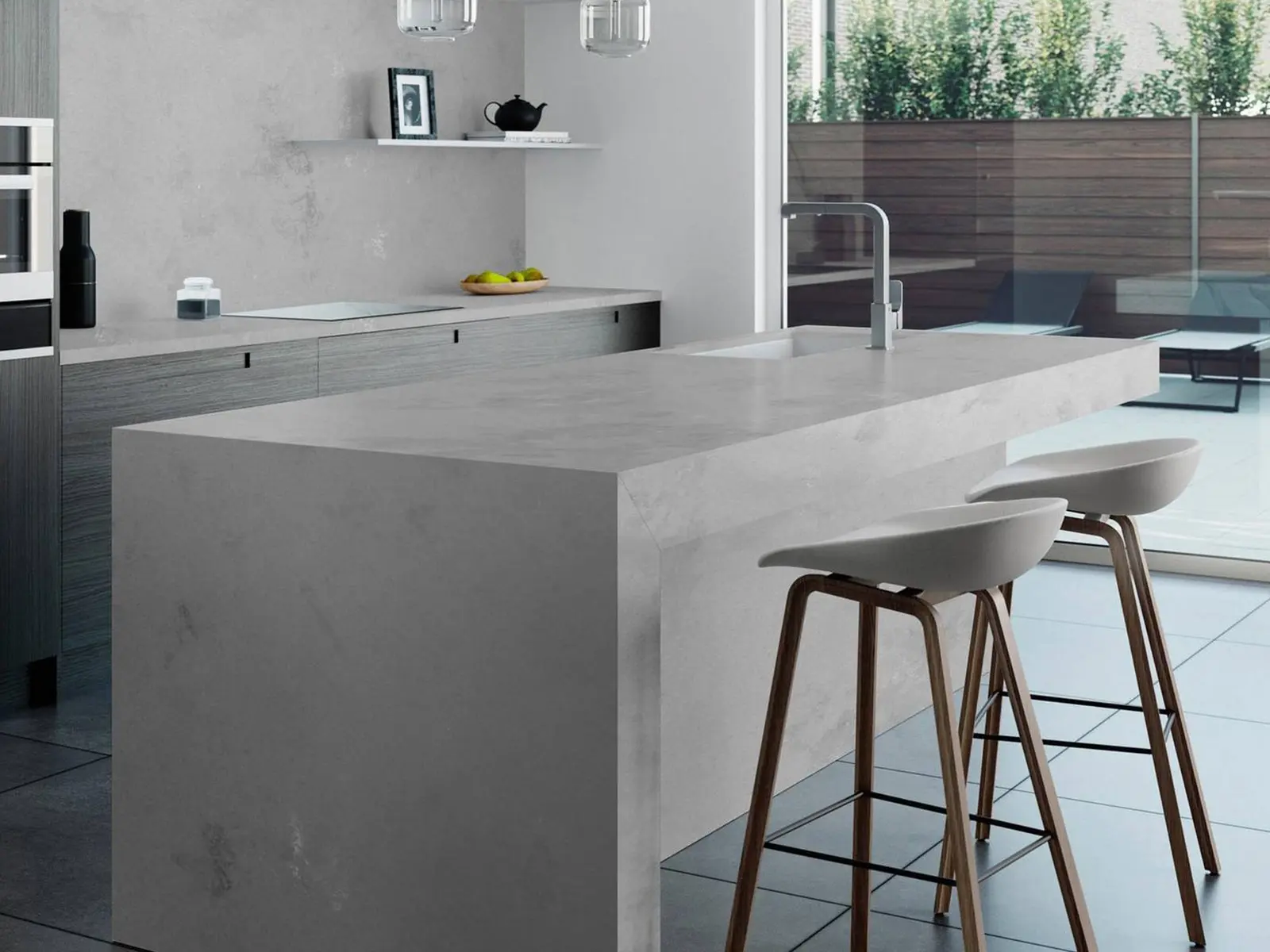
Grey is easier to compare when colour depth and finish are treated separately. A pale satin-matte grey and a deep polished graphite worktop may both be called grey, yet they produce very different surfaces in the same kitchen.
Grey Expo is a deeper, more uniformly polished grey. Cement Lux quartz is lighter, with gentle variation and a satin-matte finish. Concrete Oyster quartz adds soft cloud-like movement, giving the surface a concrete-inspired appearance without depending on a rough texture.
White handleless cabinets create a direct light-dark contrast with graphite. Timber can add warmth beside a cooler industrial grey, while black cabinets paired with a mid-grey worktop create a lower-contrast scheme. Beige or warm stone flooring usually sits more comfortably beside greige and warmer grey tones than a strongly blue-grey surface.
Finish changes to the maintenance side too. Caesarstone’s UK care guidance notes that some honed, concrete and rough finishes can need more frequent cleaning and may show fingerprints or marks more readily than polished finishes. Clouding or pattern can interrupt small residue visually, but it does not make the quartz more resistant to stains or scratches.
Black and Dark Quartz
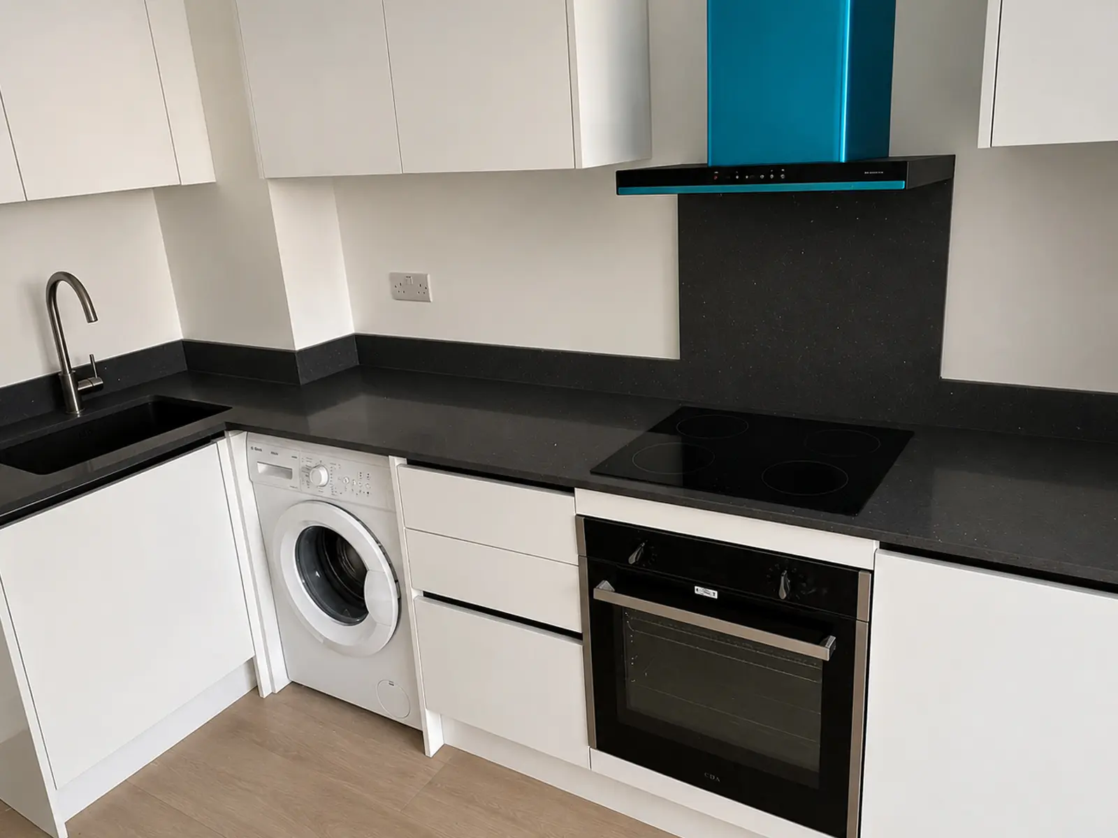
Dark quartz covers plain black, charcoal, graphite, sparkle and several marble-effect patterns. The amount of detail changes the surface considerably. Uniform black produces one strong block of colour, while white veining, fine sparkle or gold detail breaks it up.
Nero Marquina has an intense black background with bold, irregular white veins. Black Sparkle quartz keeps the base much more uniform and adds reflective mirror chips instead. Iron Ore quartz takes another direction with fine gold veining and a subtle grey undertone. More variations are available across our black and dark quartz worktops range.
The amount of dark stone in the room also matters. A dark island creates one concentrated area of contrast inside a lighter kitchen. Black across every worktop run gives the darker colour a much larger presence, so task lighting and general room lighting become more noticeable parts of the scheme.
Oak and walnut add warmer tones beside black, while pale grey and white cabinets create a sharper contrast. Our guide to styling a kitchen with black worktops provides more ideas for balancing dark surfaces with cabinetry, flooring and lighting.
Fingerprints, pale dust, dried water residue and crumbs can stand out more on a dark monotone surface because the contrast is higher. Patterning can break up some of those marks visually. Learn more about whether black quartz shows scratches and fingerprints. Caesarstone’s care guidance also notes that marks and patina can be more noticeable on darker surfaces. The stone itself is not weaker because those marks are easier to see.
How Do You Choose the Right Quartz Colour for Your Kitchen?
For strongly veined designs, look at a full-slab image or a larger section before deciding. A small sample can show the background colour and perhaps one vein, but it cannot show how the pattern will spread across a long worktop or island.
- Start with the finishes that are already fixed. Put the cabinet door, flooring and any large splashback material next to your quartz shortlist. This can remove colours that clash in undertone before you spend time comparing small differences in pattern.
- Decide how much movement you want across the worktop. Plain quartz leaves more visual attention on cabinetry and hardware. Fine speckling, soft clouding, broad Calacatta veins and sparkle all become more noticeable as the visible worktop area increases.
- Check the samples in your own light. North-facing rooms generally receive cooler light, while east- and west-facing rooms change more through the day. Farrow & Ball’s guide to light and colour explains how room orientation can shift colour perception. Compare the quartz in daylight and again under your evening kitchen lighting. Our guide to comparing quartz samples at home covers the full testing process.
- Think about the marks you notice most. Uniform black can make pale dust and fingerprints easy to spot. Plain white can make darker crumbs or coloured spills stand out. Pattern may interrupt those marks visually, but it does not make the quartz itself tougher or more stain-resistant.
Found a Quartz Colour You Like?
Once you have narrowed your choice to one or two quartz colours, we can help you turn that shortlist into a fitted worktop plan. You can order free samples to compare the colours at home or visit our showroom and warehouse if you want to see larger surfaces before deciding.
From there, compare the stone against your kitchen layout, worktop runs, island size, cut-outs and other fitting details. Our team can handle the process from templating through to fitting, so the colour you choose can be planned around the actual dimensions of your kitchen.
Use our quartz worktop price calculator to get a layout-specific estimate, or browse our full quartz range first if you still want to compare a few colours side by side.
FAQ
- What is the most popular quartz worktop colour in the UK?
There is no current national quartz-only sales ranking. White, off-white, Calacatta, grey and dark surfaces are all widely represented in current quartz ranges, with warm-neutral options also available for cream- and timber-led kitchens. - What quartz colour is best for a small kitchen?
Light colours are a useful starting point, but size alone should not decide it. Cabinet colour, daylight, walls and the amount of visible worktop all affect how light or visually heavy the finished kitchen appears. - Should a worktop be lighter or darker than the floor?
There is no fixed rule. Start by matching undertones. A pale worktop can contrast with a darker floor, while a dark worktop can sit comfortably above pale flooring if the cabinets and lighting support the combination. - Do black quartz worktops show fingerprints?
They can, particularly on plain dark surfaces. Fingerprints, pale dust and dried water marks often stand out more against black because the contrast is stronger. Veining or sparkle can make some marks less obvious. - Does quartz look different under kitchen lighting?
Yes. Cool daylight, warm lamps and room orientation can shift how white, grey, cream, and gold tones appear. Check the same sample during the day and again under the lighting you normally use in the evening.