
Calacatta quartz is usually chosen for its bright base and noticeable veining, but the final kitchen look depends heavily on the cabinets around it. The same slab can look clean beside white units, warmer beside cream, sharper beside navy, or more dramatic against charcoal.
That is why choosing cabinet colours for Calacatta quartz worktops should not be based on the worktop alone. You need to check the cabinet doors, vein colour, handles, flooring, splashback, natural light and evening lighting together.
This guide explains which cabinet colours work best with Calacatta quartz, how to match gold, grey, bronze or darker veining, and how to test samples before ordering.
Quick Answer: What Cabinet Colours Go Best with Calacatta Quartz?
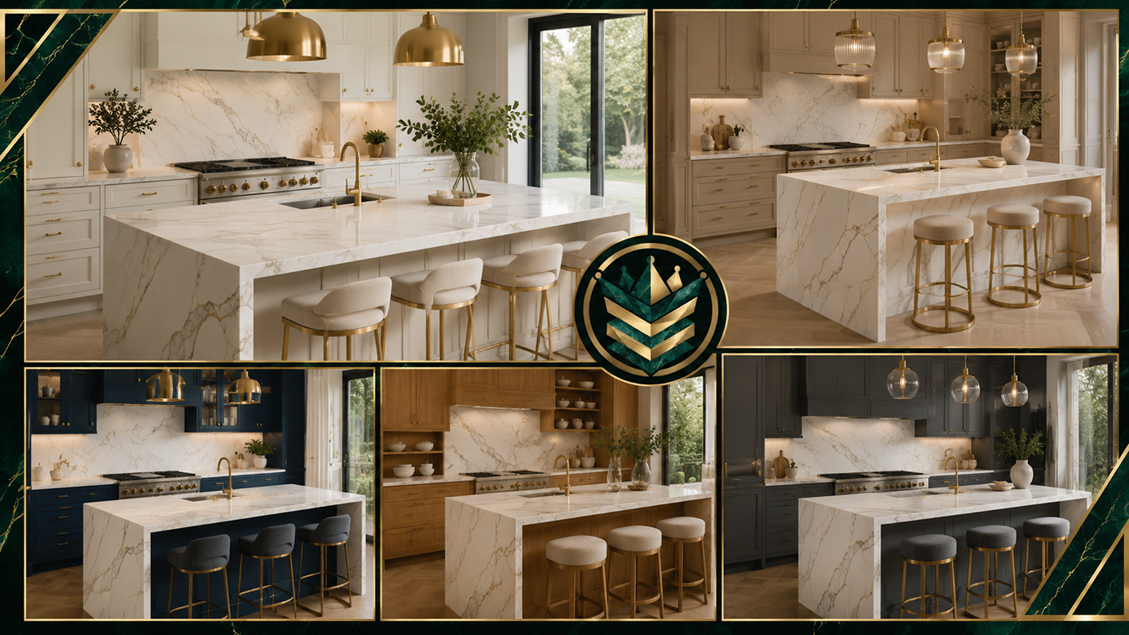
The best cabinet colours for Calacatta quartz worktops are white, cream, beige, navy, green, oak, grey, charcoal and black. The right choice depends on vein colour and contrast.
How to match cabinets to Calacatta quartz:
- White cabinets keep the kitchen bright and clean.
- Cream and beige cabinets work well with warmer gold or bronze veining.
- Navy cabinets create a strong contrast, especially with gold or grey veins.
- Green cabinets suit softer grey-veined or warm Calacatta styles.
- Oak cabinets add warmth and texture beside a white quartz base.
- Grey cabinets work best when the quartz veining has a similar undertone.
- Charcoal and black cabinets create drama but need enough light around them.
Start with the veining, not the cabinet colour alone. A gold-veined Calacatta will not behave like a cool grey-veined Calacatta, even if both have a white base.
Match the Cabinet Colour to the Veining First
Calacatta quartz often has grey, gold, bronze, beige, black or mixed veining. That veining is what decides the cabinet match more than the white background does.
Gold veining adds warmth, so it usually sits well with cream, oak, navy, taupe and brass details. Grey veining looks cooler, so it often works with white, soft grey, charcoal, chrome and brushed nickel. Bronze or beige veining can soften cream units, warm flooring or natural wood.
| Veining | Cabinet colours | Hardware |
| Gold | Cream, navy, oak | Brass, bronze |
| Grey | White, charcoal, dove grey | Chrome, nickel |
| Bronze | Taupe, oak, beige | Bronze, brass |
| Black | White, black, charcoal | Black, chrome |
The scale of the veining matters too. Large, dramatic veins need enough visual space to look deliberate. They often work best on islands, long runs or full-height splashbacks. Softer grey-veined Calacatta can be easier in compact kitchens or rooms with detailed cabinetry.
If you are ready to buy quartz worktop for a Calacatta kitchen, narrow the vein colour first, then compare cabinet samples against the actual quartz options.
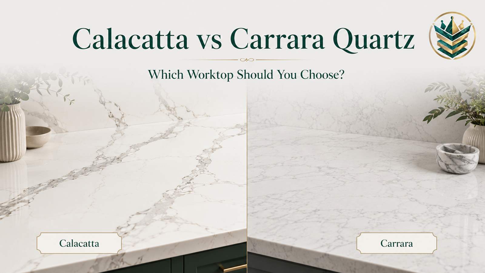
If you are still choosing between bolder Calacatta veining and a softer Carrara-style look, read Calacatta vs Carrara Quartz guide before finalising your cabinet colour.
White Cabinets With Calacatta Quartz
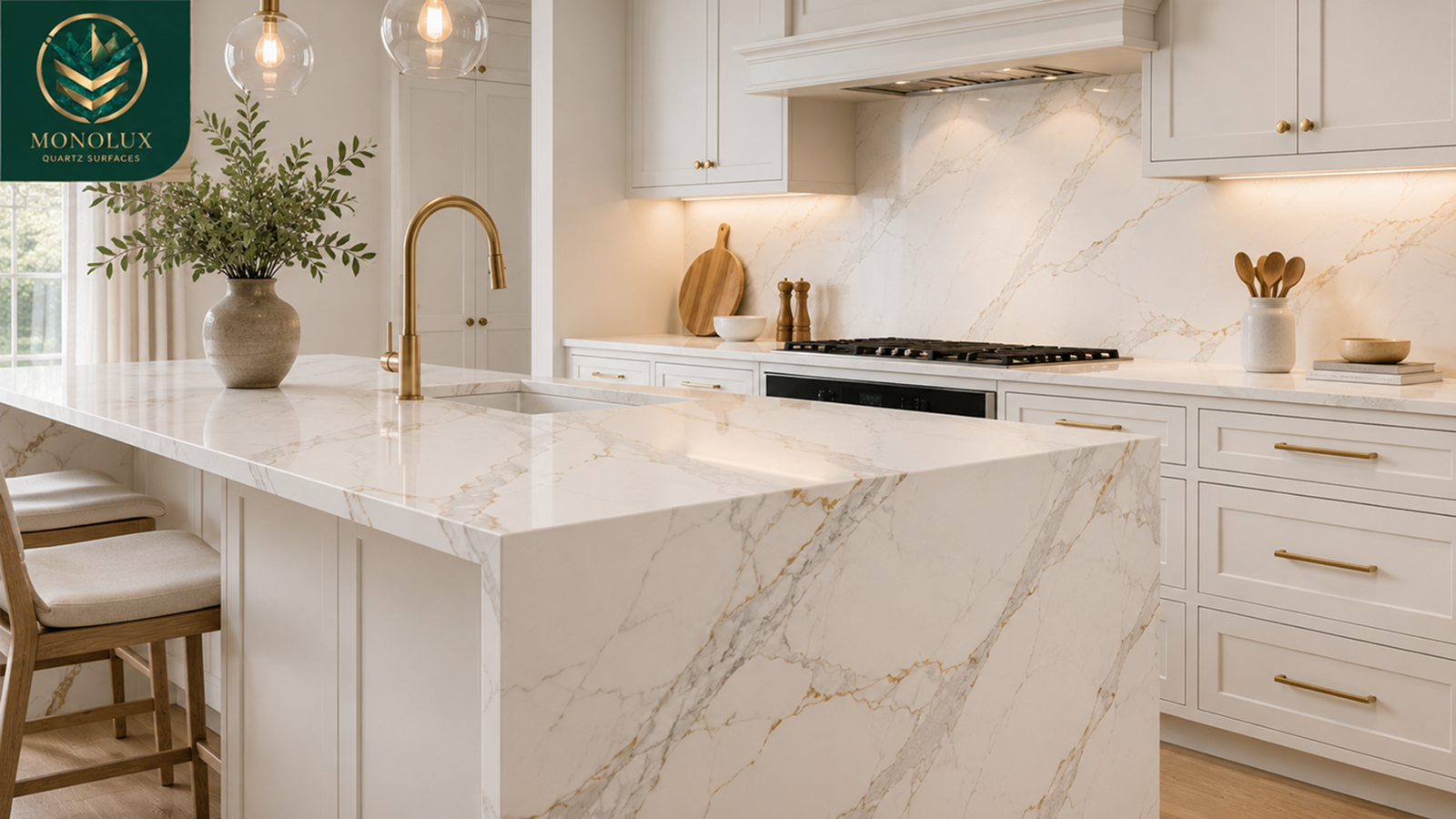
White cabinets with Calacatta quartz are a classic choice because they keep the room bright and let the worktop detail show. This pairing works well in modern kitchens, smaller kitchens and layouts where the worktop needs movement without making the room look dark.
Best for
White cabinets are useful when you want the quartz to become the detail rather than the cabinet colour. They work well with soft grey-veined Calacatta for a calmer kitchen, or with stronger veining when you want an island or long run to stand out.
Watch out for
An all-white kitchen can look flat if the cabinets, walls, worktop and splashback are too similar. High-gloss white doors also reflect light, making bold veining look sharper.
Good ways to add contrast
Use brushed brass, bronze or black handles. Add warmer flooring, a textured splashback, a soft wall colour or a bolder Calacatta pattern on the island. For a quieter white kitchen, compare Eternal Grey, Luna and Gold.
Cream, Beige and Warm Neutral Cabinets
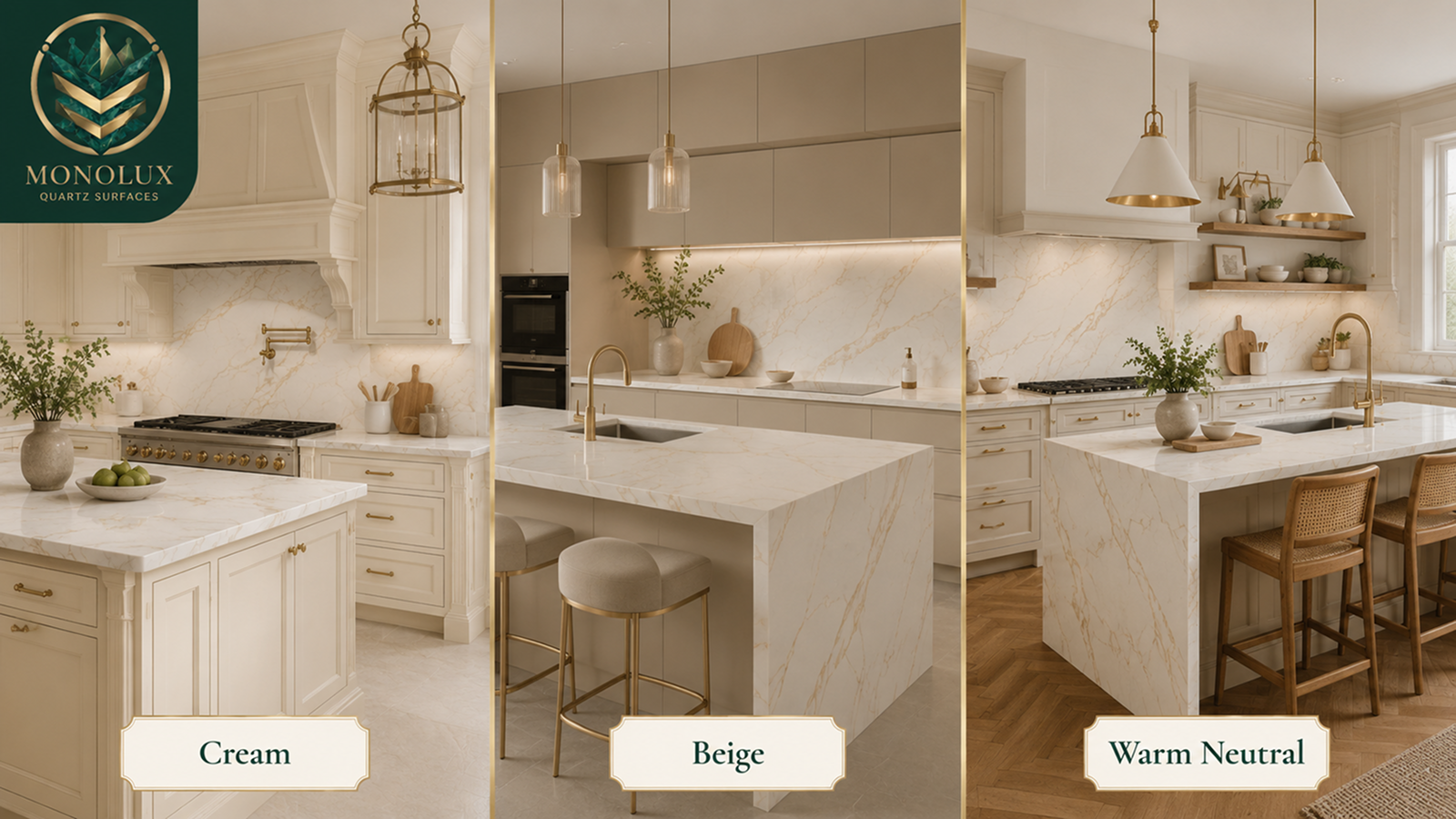
Cream, beige, greige and taupe cabinets can look beautiful with Calacatta quartz, but undertone matching matters.
A bright, cool-white worktop can sometimes make cream doors look more yellow than they are. A warmer Calacatta, especially one with gold, beige or bronze veining, usually connects more naturally to cream cabinetry.
This is where gold-veined quartz becomes useful. The warm vein can link the cabinet colour with brass handles, oak flooring, herringbone flooring, beige walls or warmer splashback tiles.
Cream and beige cabinets usually work well with gold or bronze veining, soft grey veining under warm lighting, brass or champagne hardware, and oak, herringbone or warm stone-effect flooring.
Avoid choosing the quartz from a screen photo only. Cream cabinet doors can shift under daylight, showroom lighting and warm evening bulbs. Put the quartz sample beside the exact door colour before deciding.
How We Paired Calacatta Gold with a Cream Shaker for this Bournemouth Customer
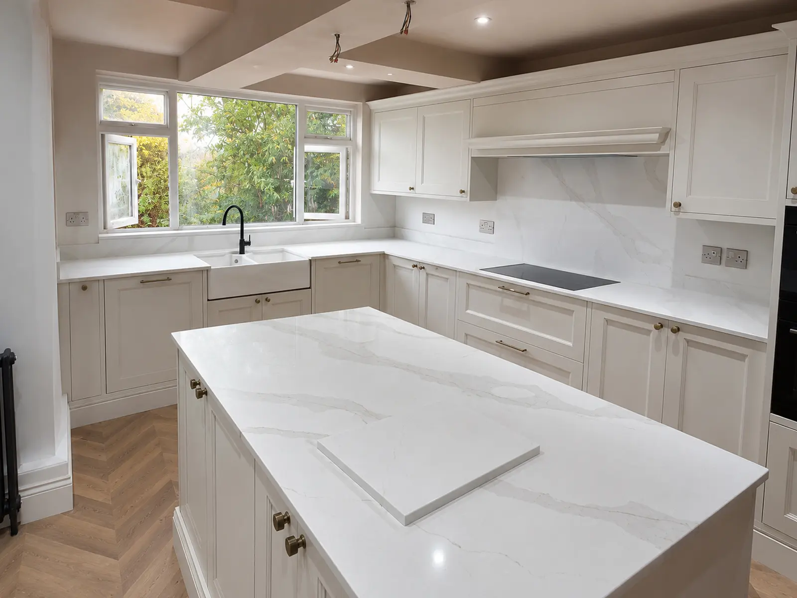
For Theodore Hastings’ project in Westbourne, Bournemouth, the cabinet and material choice needed to suit a warm, traditional kitchen with modern function. He had cream shaker-style cabinetry, brass hardware and a herringbone wood floor, so we recommended Calacatta Gold quartz worktop to add a light-reflecting surface with warm grey and gold veining.
The finished kitchen used Calacatta Gold across the perimeter runs, the large central island, the full-height quartz splashback and a matching quartz chopping board. The result connected the cream cabinets, brass details, Belfast sink, black swan-neck tap and herringbone flooring without making the kitchen look cold or overly plain.
You can read the full Theodore Hastings customer story to see the project details, finished kitchen photos and how the Calacatta Gold quartz looked with the cream shaker cabinets.
Navy Cabinets With Calacatta Quartz
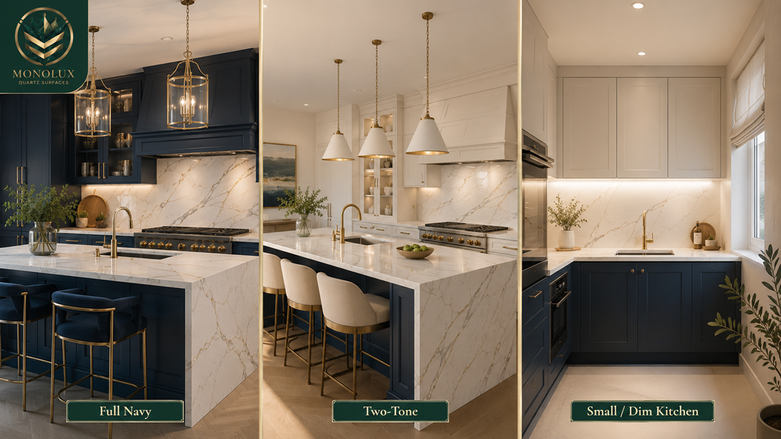
Navy cabinets and Calacatta quartz can create one of the strongest cabinet and worktop pairings. The navy gives depth, while the white base of the quartz keeps the kitchen from looking too heavy.
Gold-veined Calacatta is especially useful with navy because it can connect the worktop to brass handles, warm pendant lights and wood flooring. Grey-veined Calacatta gives navy a calmer look, especially if you prefer chrome, nickel or black hardware.
Navy works best when the kitchen has enough balance around it. In a large, bright room, full navy cabinetry can look rich and confident. In a small or dim kitchen, it may be better to use navy on the base units or island and then keep wall units, splashbacks and walls lighter.
Tip for small or dim kitchens
Do not combine dark navy cabinets, heavy Calacatta veining, dark flooring and weak lighting all at once. Choose one main feature, then let the other finishes support it.
Green cabinets can work well with Calacatta quartz, especially in shaker, heritage, farmhouse and softer modern kitchens. The best match depends on the green.
Sage and muted green
Sage, muted green and soft olive usually pair well with grey-veined Calacatta because the worktop keeps the scheme light without overpowering the cabinet colours. This is a good route for heritage kitchens where the cabinet colour should remain the main feature.
Olive and deeper green
Olive and darker green cabinets can work with gold or bronze veining, especially with brass handles, warm flooring or plaster-toned walls. The richer the green, the more careful the quartz choice needs to be.
Best rule
Let one element lead. If the green cabinet colour is strong, choose softer veining. If the Calacatta pattern is bold, keep the cabinet colour more restrained. Strong green plus heavy veining can look busy in a compact kitchen.
Oak and Wood Cabinets With Calacatta Quartz
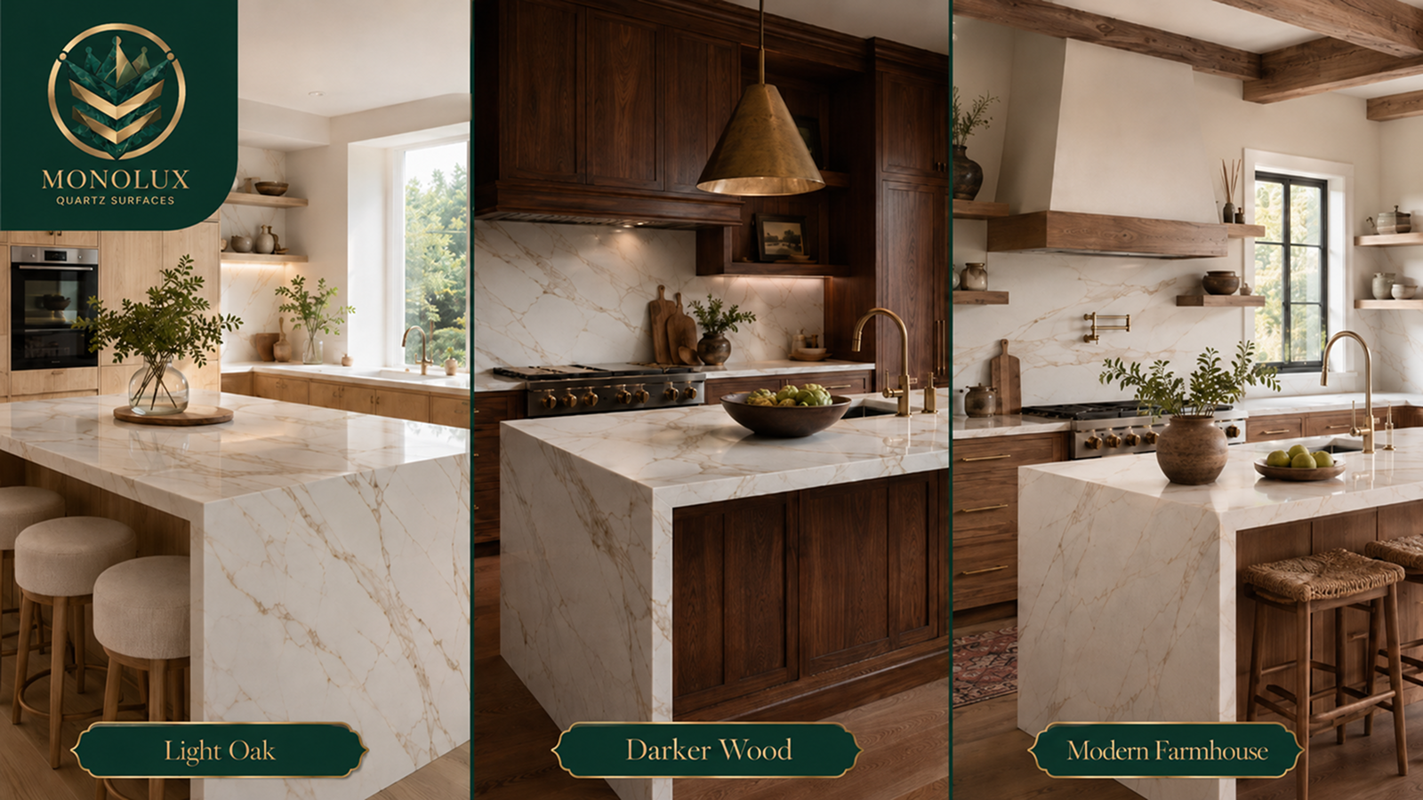
Light oak
Light oak works well with gold, bronze and beige veining because those tones pick up the warmth in the wood. It is a good choice for modern farmhouse kitchens, Scandinavian-inspired kitchens and softer open-plan rooms.
Darker wood
Walnut, dark oak or heavily grained doors can look rich with Calacatta, but the veining should not be too busy unless the rest of the kitchen is simple. Too much grain and too much veining can compete.
Modern farmhouse kitchens
For a modern farmhouse kitchen, choose controlled movement rather than the loudest Calacatta pattern. Soft veining can still give the marble-effect look without overwhelming shaker frames, open shelving, timber details or patterned flooring.
Grey, Charcoal and Black Cabinets With Calacatta Quartz
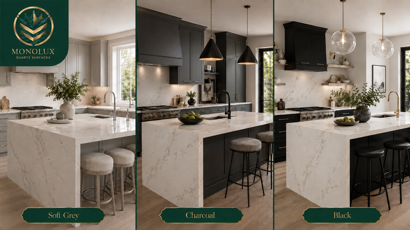
Grey, charcoal and black cabinets create a stronger contrast with Calacatta quartz. The white base of the worktop can stop the kitchen looking too dark, while the veining connects the worktop to handles, splashbacks and flooring.
Soft grey cabinets
Soft grey cabinets work best when the Calacatta has grey veining. This creates a calm, tonal kitchen, especially with chrome, brushed nickel or black handles. Warm grey or greige cabinets can also work with gold-veined Calacatta.
Charcoal cabinets
Charcoal is a good middle point between navy and black. It gives contrast without looking as heavy as full black cabinetry. A soft grey-veined Calacatta can make charcoal cabinets look lighter and more balanced.
Black cabinets
Black cabinets are more dramatic. They can look sharp with a pale Calacatta surface, but the room needs enough light, a simple splashback and a clear hardware choice. Matte black or softer charcoal is usually easier than high-gloss black.
Watch out for too much contrast
Black cabinets, bold gold veining, brass handles, dark flooring and a slab splashback can look overdesigned if the room is small. A simpler cabinet style or softer veining will usually make the result more controlled.
Should Your Cabinets Be Lighter or Darker Than Calacatta Quartz?
Calacatta quartz is usually lighter than the cabinets because it has a white or warm-white base. That makes it a good choice for both contrast-led and softer kitchens.
Use darker cabinets
Darker cabinets work well if you want the worktop to stand out. Navy, charcoal, black and dark green cabinets can make the Calacatta look brighter and more defined.
Use lighter cabinets
Lighter cabinets work well if you want a calm, airy kitchen. White, cream, beige, soft grey and light oak cabinets make the quartz look more blended into the room.
A practical guide:
- Small kitchens: lighter cabinets are usually safer.
- Large kitchens: darker cabinets can add depth.
- Dim kitchens: use dark cabinets carefully and add lighting.
- Open-plan kitchens: a darker island can create a focal point.
- Two-tone kitchens: use darker base units or an island and lighter upper units.
Two-tone cabinetry is often the easiest compromise. You can use white or cream wall units to keep the room bright, then add navy, green, charcoal or oak on the island or lower cabinets.
Check Splashbacks, Flooring and Handles Before Choosing Cabinets
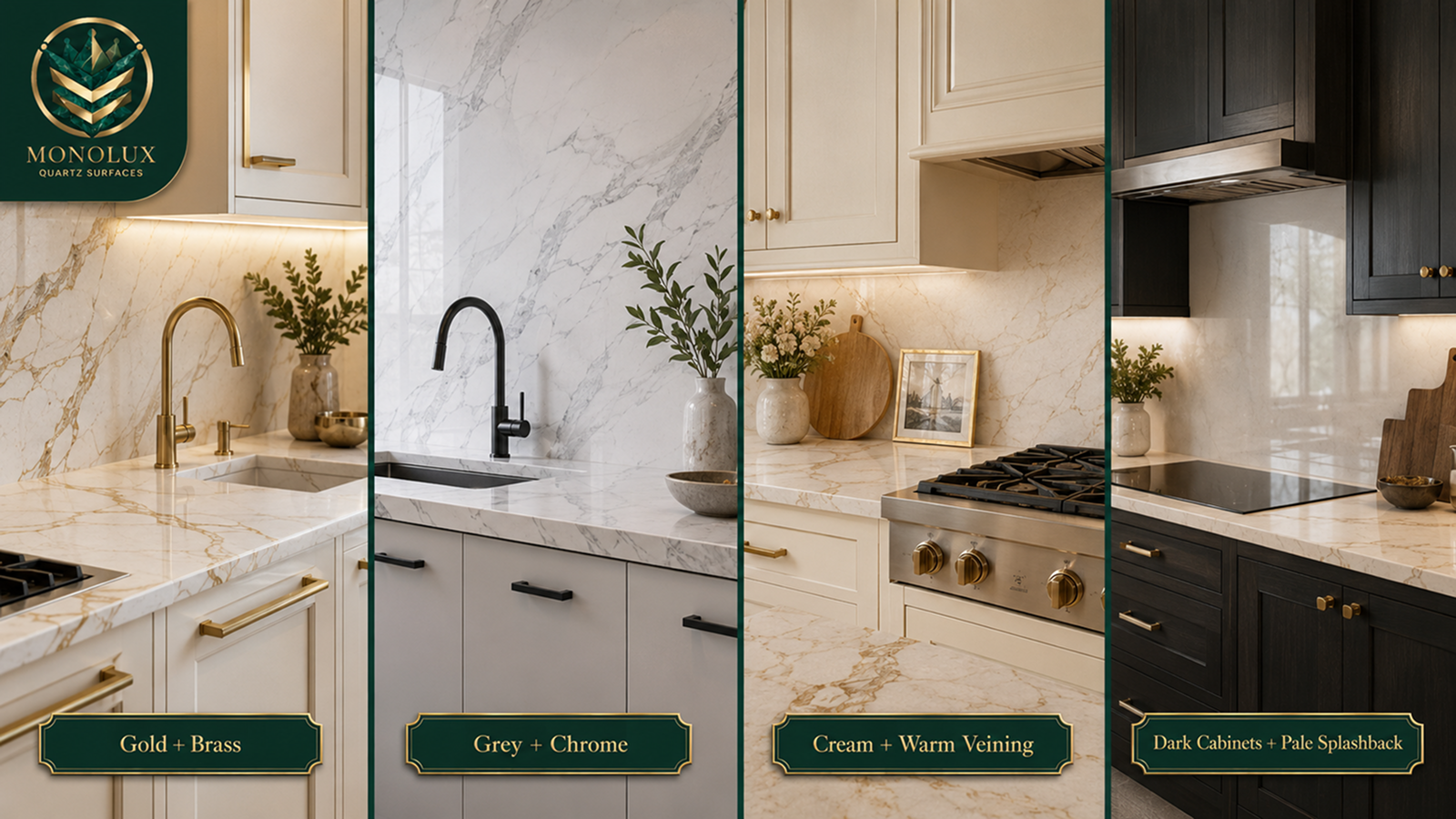
Cabinet colour does not sit alone. A Calacatta worktop also has to work with the splashback, flooring, handles, taps, wall colour and lighting.
A full-height Calacatta splashback makes the quartz much more dominant. That can look excellent in a simple kitchen, but it may look too busy if the cabinets are already bold. In that case, a simple tile splashback can calm the scheme and let the worktop stay as the main detail.
If you are planning a full-height splashback, matching upstands or extra quartz pieces, it is worth checking our Quartz Kitchen Worktop Hidden Costs article before comparing fitted quotes.
| Finish to check | What to compare | Safe direction |
| Gold veins | Handles and taps | Brass, bronze, champagne |
| Grey veins | Handles and appliances | Chrome, nickel, black |
| Cream cabinets | Quartz base tone | Warm white, gold, bronze |
| Dark cabinets | Splashback and walls | Pale, simple, reflective |
| Patterned floors | Vein strength | Softer Calacatta movement |
| Slab splashback | Cabinet detail | Plain doors, calmer handles |
A good kitchen scheme has one main feature and two supporting finishes. If the cabinet colour, worktop veining and splashback are all competing, simplify one of them.
How to Test Calacatta Quartz Samples Against Cabinet Colours
Samples are the safest way to choose Calacatta quartz with cabinet colours. A photo can show the pattern, but it cannot show how the stone will look beside your doors, flooring and lights.
Use this checklist:
- Place the sample against the cabinet door vertically.
- Place it flat at worktop height.
- Check it in morning daylight.
- Check it in afternoon or evening light.
- Test it near the sink, hob and island area.
- Compare it beside handles and taps.
- Put it next to flooring and splashback samples.
- Check it under warm LED lighting.
- Check larger slab or project photos for bold veining.
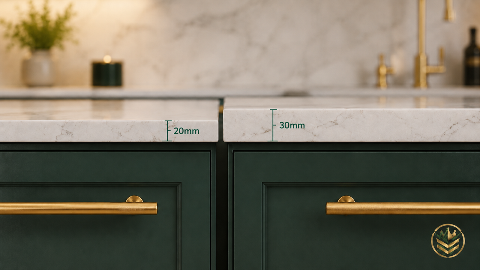
If thickness is part of your design decision, compare the practical and style differences in our 20mm vs 30mm Quartz Worktops before sending your final quote details.
Compare Calacatta Quartz Worktops and Order Free Samples Before Choosing Your Cabinets
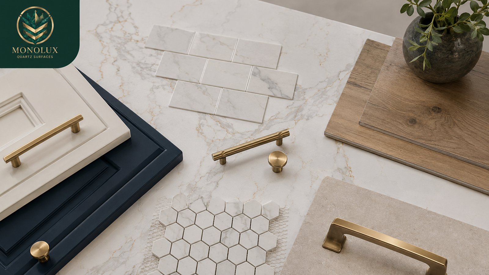
The best cabinet colour for Calacatta quartz is the one that works with the whole kitchen, not just the worktop sample. A navy island, cream shaker run, oak cabinet door or green pantry wall can all change how the quartz looks.
With MonoLux, you get:
- Calacatta choice and samples: compare soft grey, warm gold, bronze and bolder veining options before deciding.
- Showroom and warehouse support: see larger slabs, finishes and material details if you want more than a small sample view.
- Clear starting prices: our quartz worktops start from £89 per square metre, with final fitted pricing based on layout, thickness, cut-outs, splashbacks and installation details.
- Quote and fitting guidance: after you shortlist your material, use the quartz worktop price calculator and let our team review the worktop choice, layout and fitting details.
Once you have compared your cabinet doors with a few Calacatta samples, send your measurements through our Online Quote Tool.
Add your preferred quartz, thickness, sink and hob cut-outs, splashback plans and any island details, and our team will review the request in under two hours so you can move from colour choice to a fitted quote with the material, layout and finish checked properly.
FAQs
- What colour cabinets go best with Calacatta quartz worktops?
White, cream, navy, green, oak, grey, charcoal and black can all work. Match warm veins with warmer cabinets, and grey veins with cooler or softer cabinet colours. - What colour cabinets go with Calacatta Gold quartz?
Calacatta Gold usually works with cream, warm white, navy, oak, taupe, greige and some greens. Brass, bronze or champagne handles can help connect the warm veining. - Is Calacatta Gold quartz warm or cool?
Calacatta Gold is usually warm because of its gold, beige or soft brown veining. Warm lighting brings those tones out, while cooler lighting can make the surface look sharper. - Do white cabinets look good with Calacatta quartz?
Yes. White cabinets keep the room bright and let the veining stand out. Add contrast through handles, flooring, splashback texture, wall colour or warmer lighting. - Can navy cabinets work with Calacatta quartz?
Yes. Navy gives strong contrast against the white quartz base. Gold veining works well with brass hardware, while grey veining creates a calmer navy-and-white scheme. - Can green cabinets work with Calacatta quartz?
Yes. Sage and muted green work with softer grey veining. Olive and darker green can work with gold or bronze veining, especially with brass handles or warm flooring. - Should Calacatta quartz be lighter or darker than cabinets?
Calacatta quartz is usually lighter than the cabinets. Dark cabinets create contrast, while lighter cabinets create a softer kitchen. Two-tone cabinets can balance both. - What backsplash looks best with Calacatta quartz and coloured cabinets?
Use a simple backsplash if the cabinets or veining are bold. Matching slab splashbacks work best with simpler cabinets, while soft tiles can calm stronger patterns. - Should I order Calacatta quartz samples before choosing cabinets?
Yes. Check samples beside cabinet doors, handles, taps, flooring and splashback samples. Look at them in daylight and evening lighting before moving to the quote stage.