
A quartz sample can tell you a lot about colour, undertone, surface detail and finish, but it cannot show you exactly how a full worktop will look across a long run or kitchen island. That is why comparing samples properly matters more than simply picking the one that looks best when it arrives.
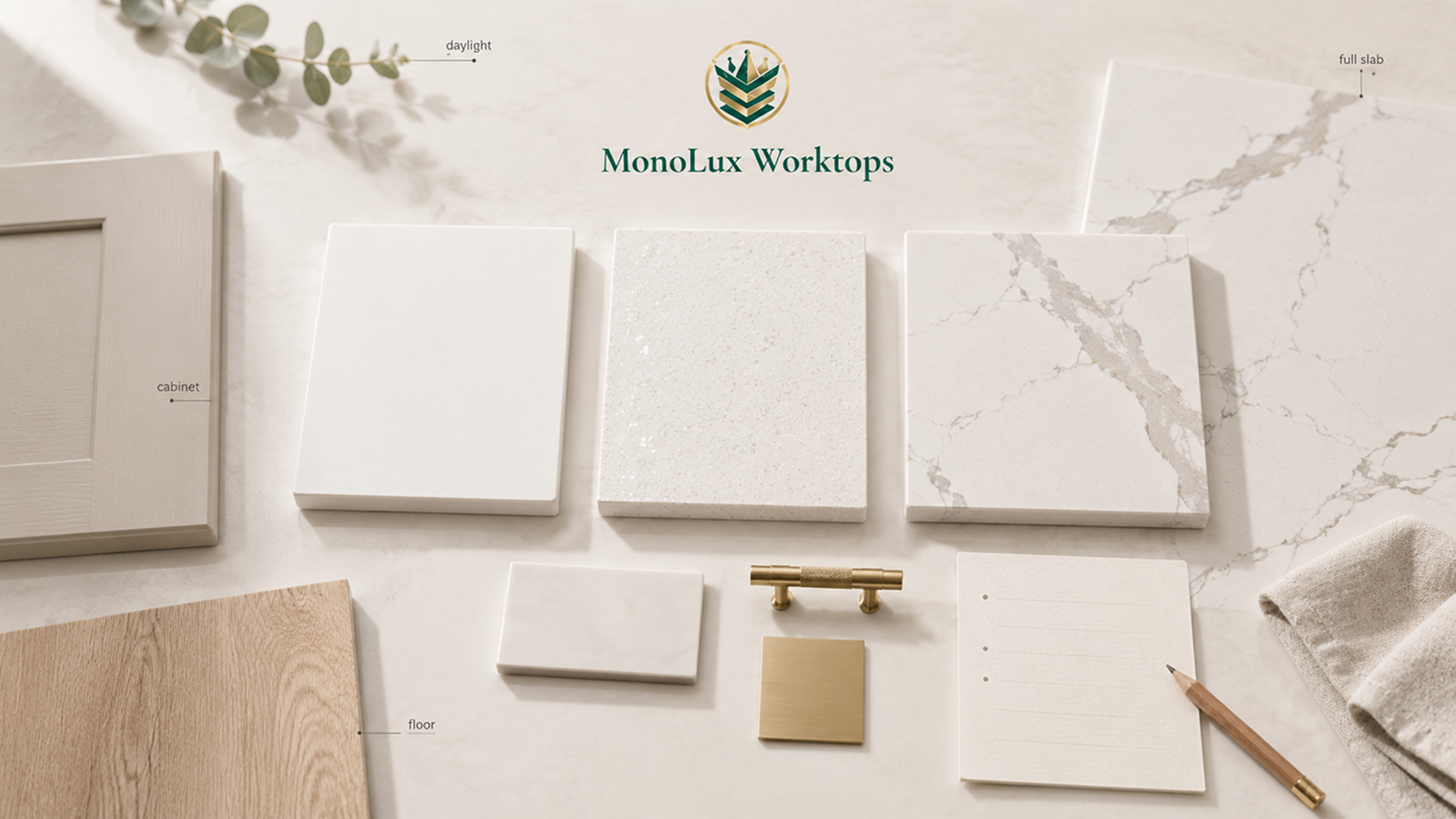
Start by narrowing the range to a few serious options. Then place those samples in the actual kitchen, beside the cabinet doors, flooring and other finishes that will stay in the room. Check them in daylight and again with your evening lighting on. For quartz with strong veining or large-scale movement, look at a complete slab or finished kitchen before making the final choice.
You can browse our quartz worktops to narrow down the colours and effects you like before ordering samples. If you are still deciding where to buy a quartz worktop for your kitchen, comparing the finalists at home gives you a much better basis for choosing than product photos alone.
Quick Answer: How Should You Compare Quartz Worktop Samples at Home?
A quartz sample is most useful when you test it in the room where the finished worktop will actually sit.
- Narrow your choice to two or three serious options before ordering samples.
- Compare each sample beside the actual cabinet doors, flooring and splashback materials.
- Check the colour and undertone in daylight and again with your evening lights on.
- View reflective or sparkle finishes from several angles.
- Judge bold veining at a larger scale before committing to an island or long worktop run.
- Use a full slab or completed kitchen to check pattern movement that a small sample cannot show.
- Keep brief notes on each option so similar whites, greys or veined designs do not blur together.
How Many Quartz Samples Should You Compare?
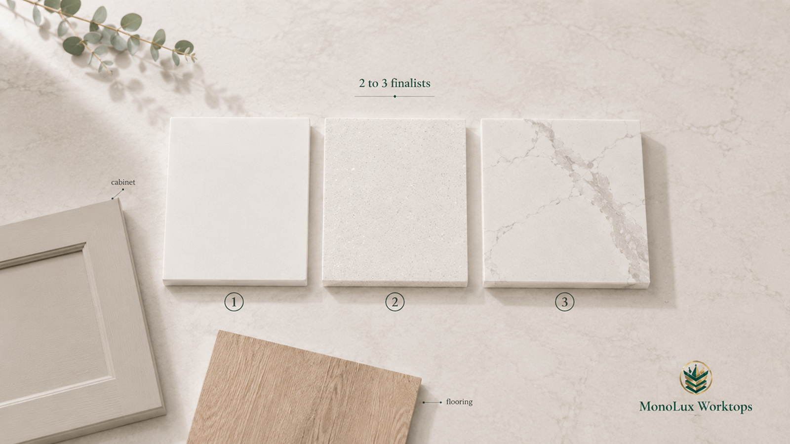
A shortlist of two or three samples is usually enough to make a useful comparison without turning the kitchen table into a catalogue.
Two or three is not a fixed rule, but a smaller shortlist makes similar tones and veining easier to compare side by side.
Start with the larger visual decisions online. If you are unsure where to begin, our guide to the most popular quartz worktop colours in the UK can help you decide whether to focus on plain white, fine sparkle, soft grey veining, warmer gold movement or a dark surface. Once you have narrowed that down, bring home the closest matches.
We currently offer up to three free quartz samples, so you can compare a small shortlist at home before choosing your worktop. Check the individual product page from our main page to see if a sample is available for the design you like.
Once the samples arrive, keep them together while you compare them. Looking at one on Monday and another three days later makes subtle differences harder to judge. Put the finalists beside the same cabinet door, floor sample and splashback, then move them through the kitchen together. That gives each option the same test rather than relying on memory.
What Can a Small Quartz Sample Actually Tell You?
A small sample is good for checking the base colour, undertone, sparkle, surface finish and how the quartz looks beside your cabinets or flooring. What it cannot show properly is the full pattern across a long worktop, island or splashback.
With heavily veined quartz, you may only see a small section of one grey, gold or bronze vein on the sample. The full slab can look very different once those veins run across a larger area, so check a slab image, showroom slab or completed kitchen before choosing a bold design.
| A sample can help you judge | What needs a larger view |
| Base colour and undertone | Full vein movement across the slab |
| Fine speckles and local detail | Pattern distribution across a long worktop |
| Sparkle and reflective particles | How the pattern reads across a large island |
| Surface sheen and texture | Vein flow over a waterfall end |
| How the quartz sits beside a cabinet colour | How several visible sections work together |
| How it responds to your kitchen lighting | The overall balance of pattern across the finished room |
Samples should therefore be treated as part of the selection process rather than a miniature copy of the finished worktop. Manufacturer guidance also notes that samples are representative, and the final surface can vary in tone or pattern.
For plain or finely speckled quartz, a small sample may tell you most of what you need to know about the visual character. If you are concerned that a simple surface may lack character, read whether plain white quartz is too boring for kitchens. With a design such as Calacatta quartz worktops, where larger veins are one of the main features, the next step should often be looking at a full slab or completed installation.
Check the Sample in the Kitchen at Different Times
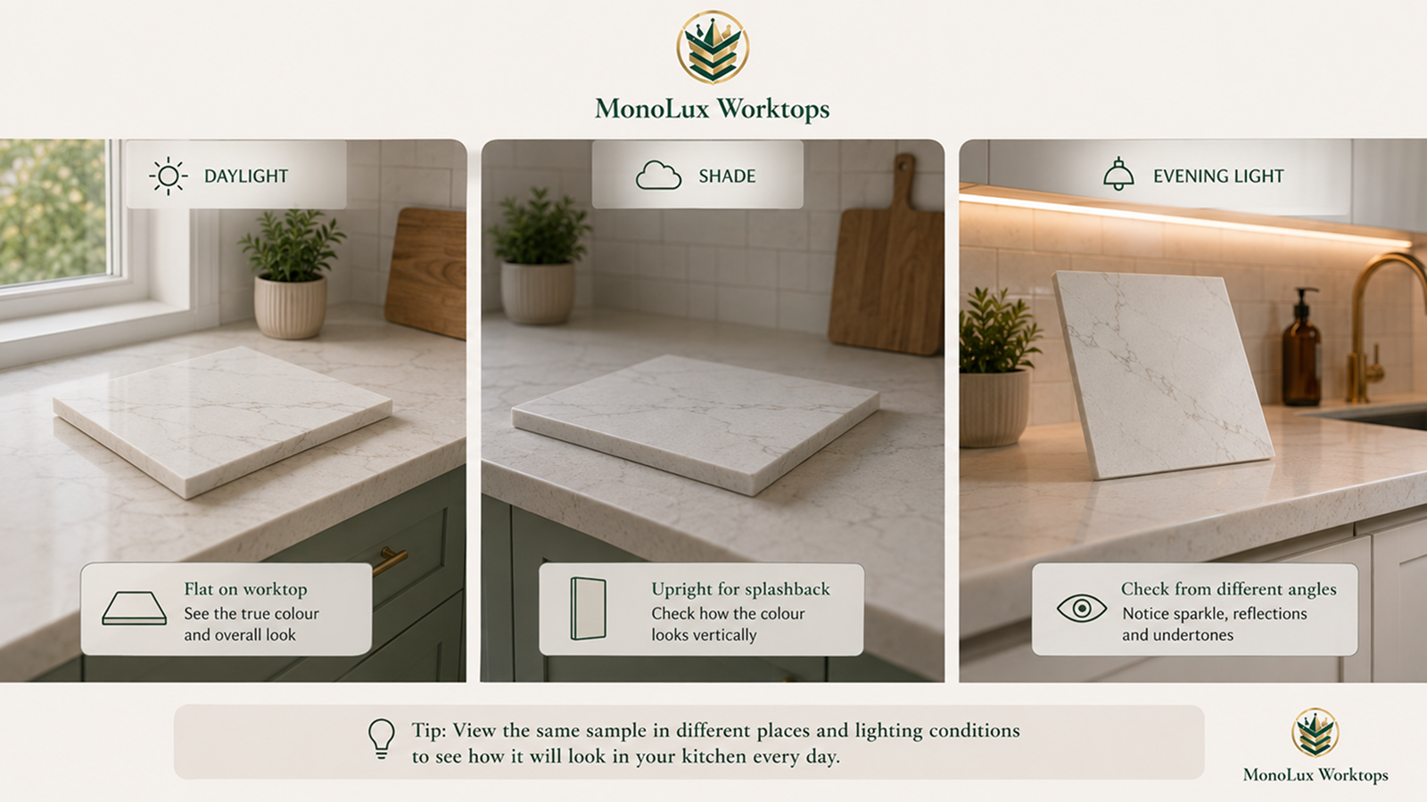
Do not judge the sample under one light and make the decision there. The same white, grey or gold-toned quartz can look noticeably different beside a window in the morning and under kitchen lighting later in the day.
- Start with the sample flat on the worktop area: This is the closest match to how most of the quartz will actually be seen once fitted. Put it near the sink, hob, island or another part of the kitchen where the stone will cover a large area.
- Move it into brighter and darker parts of the room: A sample beside a window may look cleaner or cooler than the same piece in a shaded corner. Check both before ruling a colour in or out.
- Look again with the evening lights on: Switch on the lighting you normally use after dark. Warm lighting can bring out beige, cream or gold tones, while cooler light can make grey and white details look sharper.
- Change your viewing angle for sparkle and polished surfaces: reflective particles can be quite subtle from one position and much more visible from another, especially beneath spotlights or pendants.
- Hold it upright where that view matters: If you are considering the same quartz for a splashback or waterfall end, hold the sample vertically as well. A surface can look different upright because it catches light from another direction.
There is no single lighting setup that tells you how a quartz colour really looks. The best thing you can do is to see the same sample in the places and lighting conditions it will live with every day.
Compare the Quartz With the Materials That Are Staying
A quartz colour can look right on its own and wrong the moment it sits beside the cabinet door. Bring the sample together with the finishes that are already decided, especially the cabinets, flooring and splashback.
Cabinet colour: Put the quartz directly beside a real cabinet door rather than relying on a brochure or screen image. This is particularly useful with whites and creams. Two pale surfaces can look almost identical separately, then one suddenly reads yellow, blue or grey once they are side by side.
If you are considering a veined design, our guide to the best cabinet colours for Calacatta quartz explains how different cabinet shades work with grey, gold and warmer veining.
Flooring: Check the sample against the floor from normal standing height as well as close up. Warm oak, beige tiles and cool grey flooring can all pull different tones out of the same quartz.
Splashback and wall colour: If the splashback has a strong pattern, a heavily veined worktop may make the area feel busier than either material did on its own. With a plain splashback, you have more room for noticeable veining or sparkle.
Handles, taps and other metal finishes: These details are smaller, so they should not decide the worktop by themselves. They can still help you spot undertones, especially with gold, bronze, grey or black veining.
If you are comparing several colour families, use the sample to narrow them rather than trying to solve the whole kitchen in one go. A warm white may suit cream cabinets better than a colder one, while a darker quartz may look better once you see it beside pale flooring or lighter doors.
If you are leaning towards a darker surface, see how to style a kitchen with black worktops without making the room feel too dark.
For more focused comparisons, you can also browse our white quartz worktops, Calacatta quartz and dark quartz ranges after you have worked out which direction suits the room.
When Should You View the Full Quartz Slab?
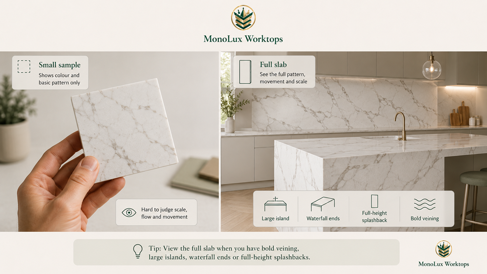
For plain or finely speckled quartz, a small sample can often give you a good sense of the colour, finish and overall character. Larger veining needs more context. A small piece may catch one part of a grey, gold or bronze vein without showing how often it appears, how wide it gets or how much of the slab stays relatively quiet.
A full-slab view becomes more useful when the quartz will cover a large island, a long uninterrupted run or a full-height splashback. The same applies to waterfall ends, where the pattern continues from the horizontal worktop down the side. On these larger areas, vein direction and spacing become a much bigger part of the finished kitchen than they appear on a hand-sized sample.
In more compact rooms, it is also worth considering whether Calacatta quartz is too bold for a small kitchen before selecting a design with particularly wide or dramatic veins.
Multi-slab projects deserve the same check. If several pieces of quartz will sit next to one another, ask how the pattern will be arranged around joins and other visible breaks. You do not need to inspect a full slab for every simple worktop, but bold patterns and large areas give you more reason to see the material at scale before ordering.
The Calacatta Bronze kitchen we created for Yasmin Holloway shows why scale matters. Bronze, taupe and grey veining runs across the island, waterfall ends and full-height splashback. A sample can show those colours up close, while the completed kitchen shows how much visual space the pattern takes once it covers several large surfaces.
Make Your Final Comparison Before Ordering
Once you are down to two or three finalists, put them together and make one last comparison rather than judging each sample separately. At this point, you are checking for anything that might bother you once the worktop covers a much larger area.
- Does the base colour still sit well beside the cabinet doors and flooring?
- Do you like it in both the brightest and darkest parts of the kitchen?
- Does the evening lighting bring out any yellow, blue, grey or gold tone you had not noticed before?
- If the surface has sparkle or a polished finish, are you happy with how much reflection you see under direct light?
- If it has strong veining, have you seen enough of the full slab or an installed example to understand the larger pattern?
- If two options are very similar, which one works better with the materials already fixed in the room?
Write down one or two notes for each finalist as you go. Similar whites, greys and marble-effect designs can start to blend together after several days of comparing them, and a simple note such as “warmer beside the cabinets” or “too reflective at night” is more useful than trying to remember which one looked better earlier in the week.
You can also photograph the samples together to keep a record of the shortlist, but use the photos as a reminder rather than a colour reference. Phone cameras, screen settings and room lighting can all change how the surface appears.
Order Free Quartz Samples From MonoLux
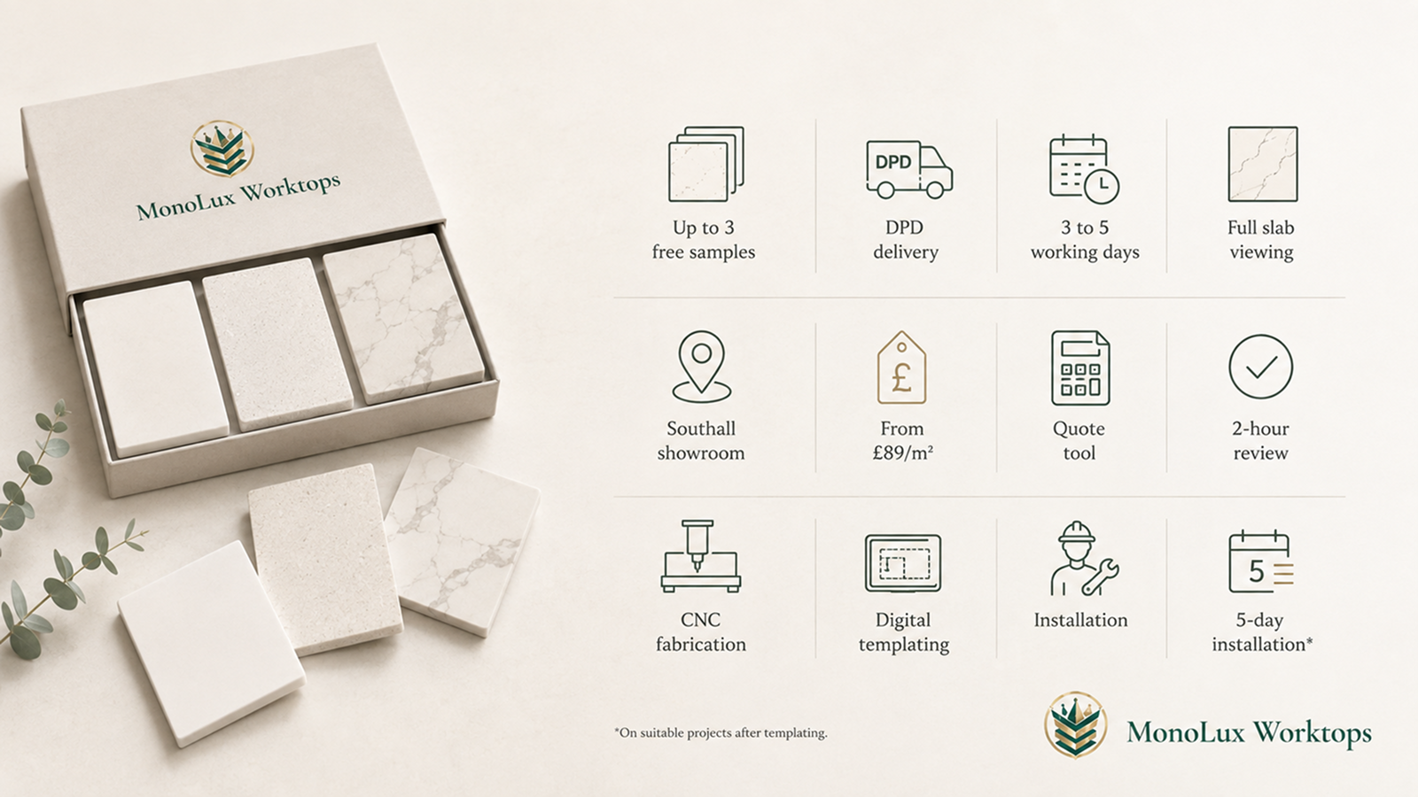
Once you have narrowed the range, order up to three free quartz samples from available MonoLux product pages and compare them at home using the checks in this guide. If you are considering strong veining, a large island or a waterfall end, you can also visit our Southall showroom and warehouse to see complete slabs before choosing.
Our quartz range starts from £89/m², with plain, sparkle, marble-effect, Calacatta and darker designs available across the collection. After choosing your material, use our quartz worktop price calculator to add your measurements, thickness, cut-outs, splashbacks and other project details.
Your initial estimate is then reviewed by the MonoLux team, with a 2-hour expert quote review available. We also handle CNC fabrication, digital templating and installation through our own process, with five-day installation available on suitable projects after templating.
FAQs
- Can You Get Free Quartz Worktop Samples?
Yes. MonoLux offers up to three free samples on product pages where sampling is available. They are sent by DPD and normally arrive within three to five working days. - How Many Quartz Samples Should I Compare?
Two or three finalists are usually easier to compare properly than a large pile of similar options. Narrow the range first, then test the strongest choices side by side in the same kitchen. - Can a Small Quartz Sample Show What the Full Worktop Will Look Like?
Not completely. It can show the base colour, undertone, local detail and finish, but large veins and wider pattern movement need a full slab, large-format image or completed kitchen for context. - Should I Check Quartz Samples in Daylight or Artificial Light?
Check both. Look at the samples during the day, then again with the kitchen lights on in the evening. Colours, sparkle and reflections can appear different as the light changes. - Should a Quartz Worktop Be Lighter or Darker Than the Floor?
There is no fixed rule. Put the quartz and flooring samples together and compare their undertones, contrast and how they sit with the cabinets before deciding.